The new year is well underway and I find myself immersed in staying busy, as usual. I’m about two weeks into teaching courses at Valencia, 3 weeks into a new quarter full of new classes at SCAD while I continue to make up 2 courses from last quarter too. In one of the courses I’m taking this semester we’re rebranding a middle eastern restaurant located in Neptune Beach, Florida. Last weekend we took a trip to the restaurant (and the beach!) so that I could get a good idea of both the area and restaurant before getting too far along in this project.
When we arrived home Monday I learned we were beginning our logo design preliminary sketches this week. I’ve done many logo designs over the years, so sketches really don’t bother me. However, I’ve never had a large quantity requirement. As I reviewed the requirements I learned we were required to sketch 100 preliminary thumbnails of our logo ideas. Back during my days as a student at Valencia I recall only being required to do 10 or 20 or enough to show several strong ideas. For me sketching out ideas is always a fun process. However, since I’ve been teaching the last 5+ years I’ve come to realize even more now that sooooo many new students and clients take for granted how valuable the process of logo design really is. It’s not uncommon for many students to complain having to do 10 or 20 rough drafts, let alone 100. I suppose this number seemed a little daunting for me knowing just how many other things I am doing that equally need my attention, but I welcomed the challenge. I decided that today would finally be the day for me to get my sketches out of the way.
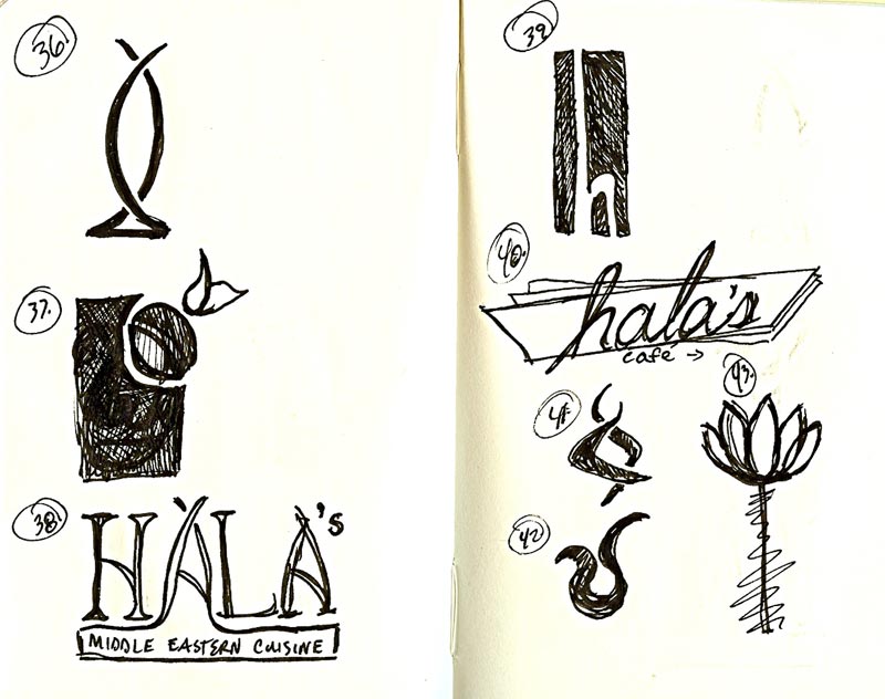
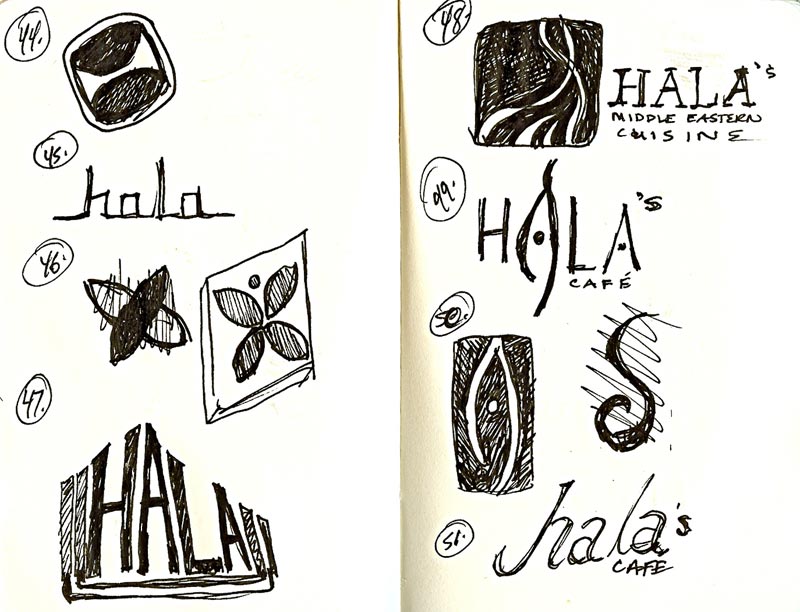
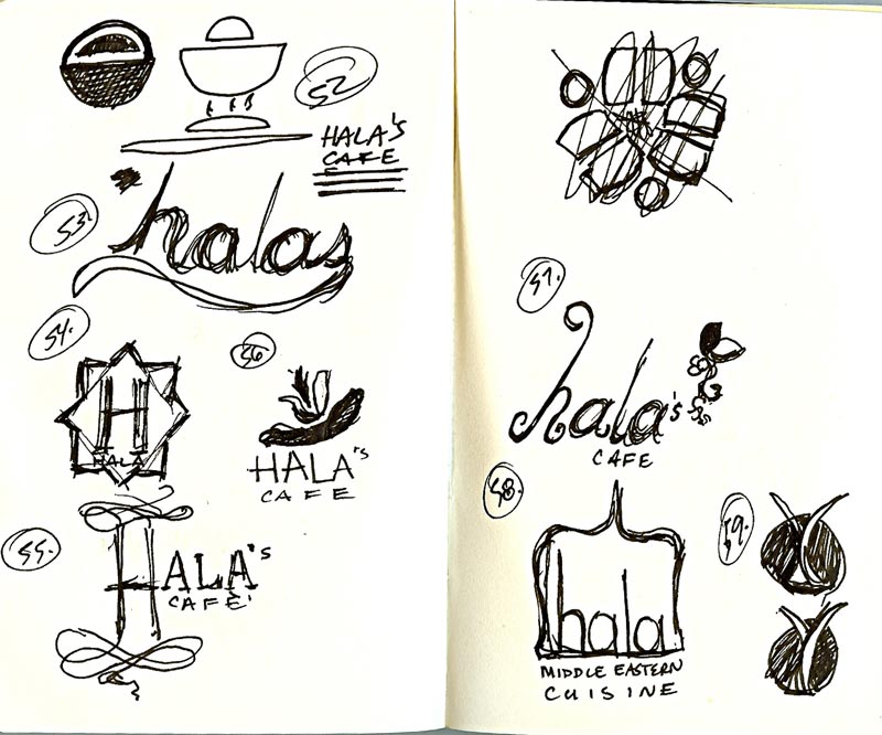
Anyhow, after a good 5 or 6 hours of doodling ideas – I thought I’d share ALL 100 thumbnails. I know many of you heard me twittering about my sketches and were curious so I hope you enjoy finally seeing my silly doodles. Keep in mind that when you produce work at a rapid rate it’s far more important to work through ideas than to perfect every idea. For me the quantity reminds me of my photography, I typically take hundreds of photos and only keep a few great ones to share. In time the same will happen with these logo ideas – as I continue to work on this project.
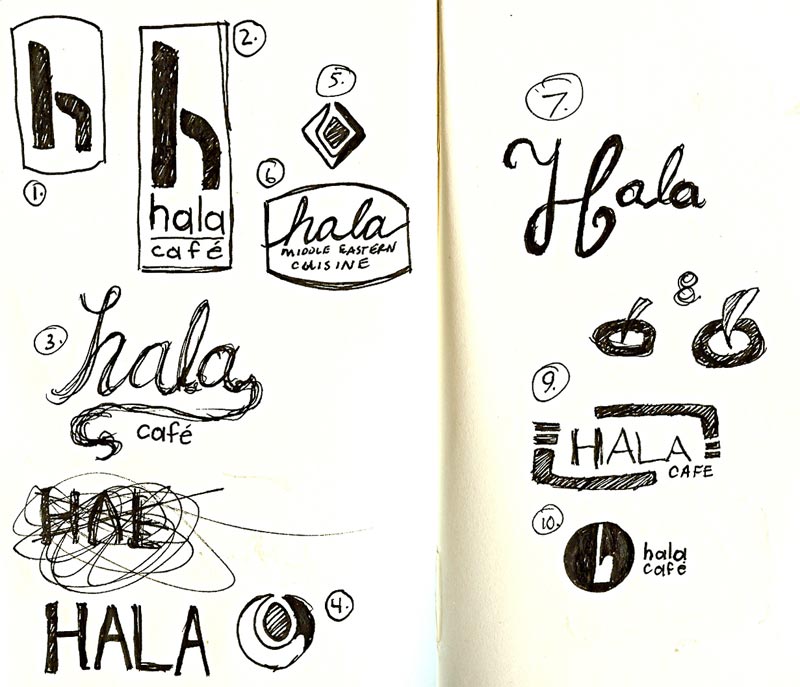
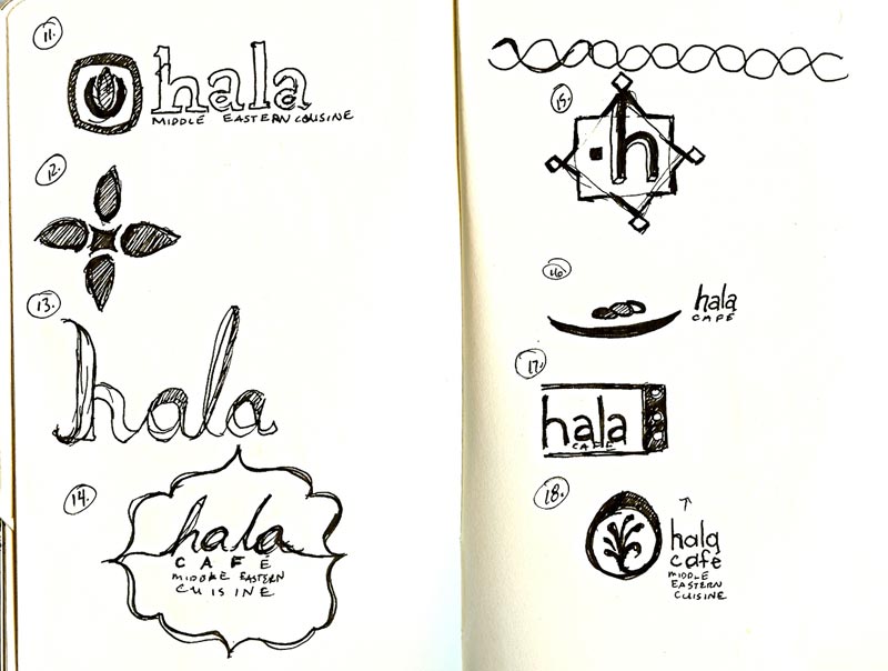
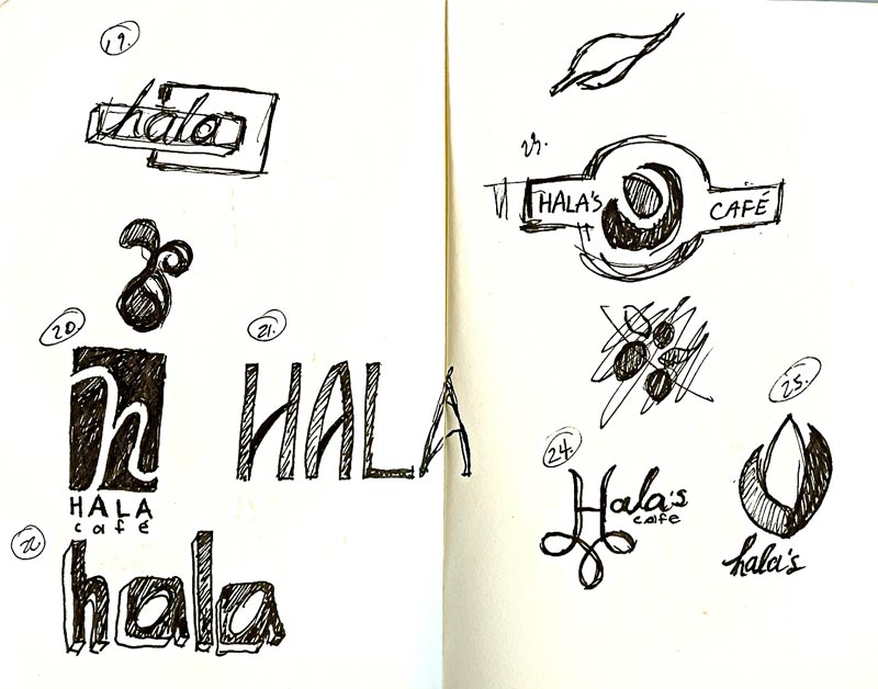
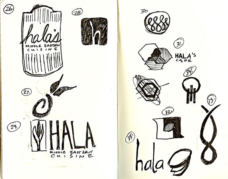
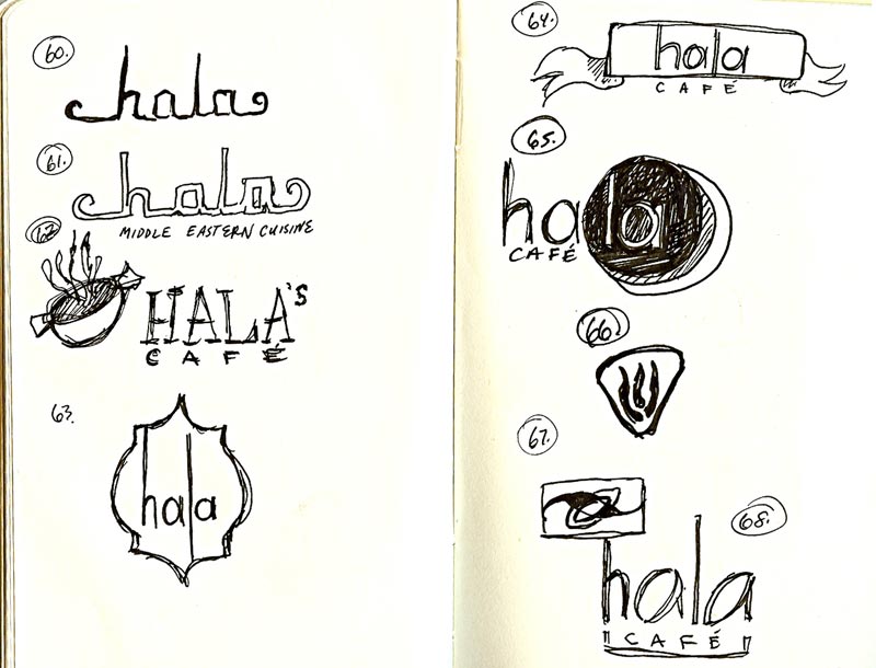
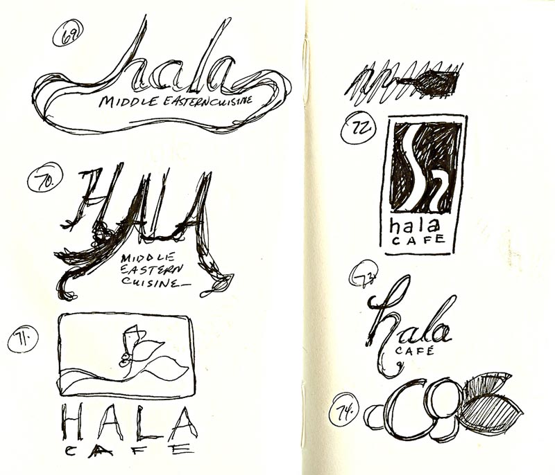
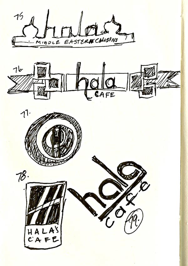
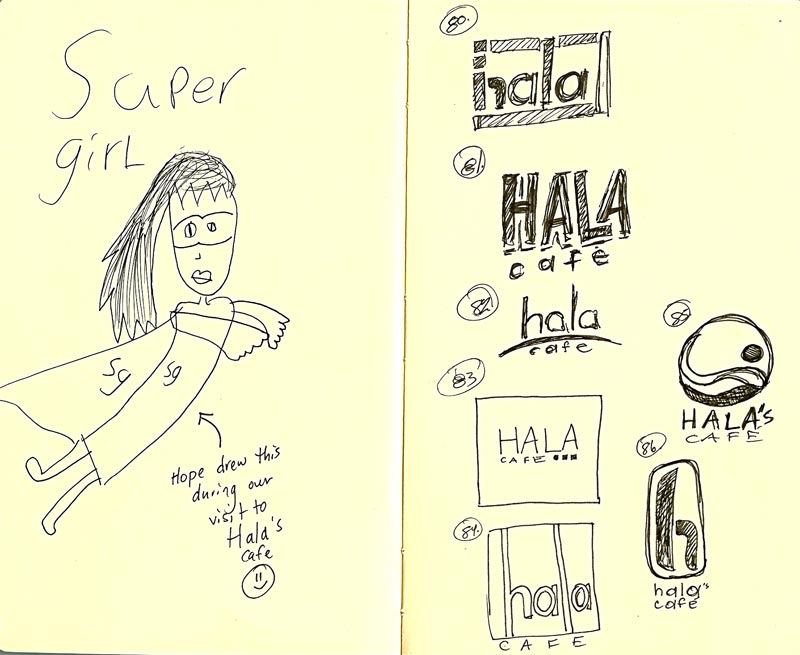
As I approached my final 20 sketches I came to the end of my moleskine notebook and went to grab my other one to finish up. It’s not uncommon for me to allow the kids to doodle in my notebooks. I love to encourage their creativity, it keeps them busy, and well…I love to be surprised by their doodles. While we were visiting Hala’s last weekend I allowed Hope to draw in my notebook while I met with the owner, my teacher, and another classmate. I had seen some of her doodles but tonight was the first time I saw her “supergirl” illustration. How hilarious is this? As I know you all have called me “superwoman” on more than one occasion – I couldn’t resist sharing her illustration and beginning the remainder of my logos right beside her illustration. As I finished all I could think was, “I sure could use some real super powers right now to help me”.![]()
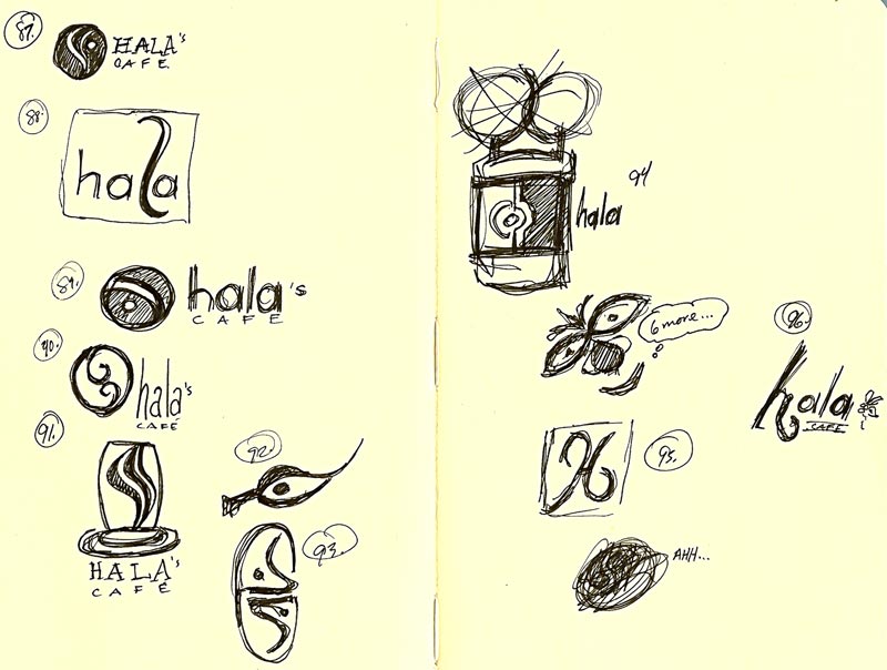
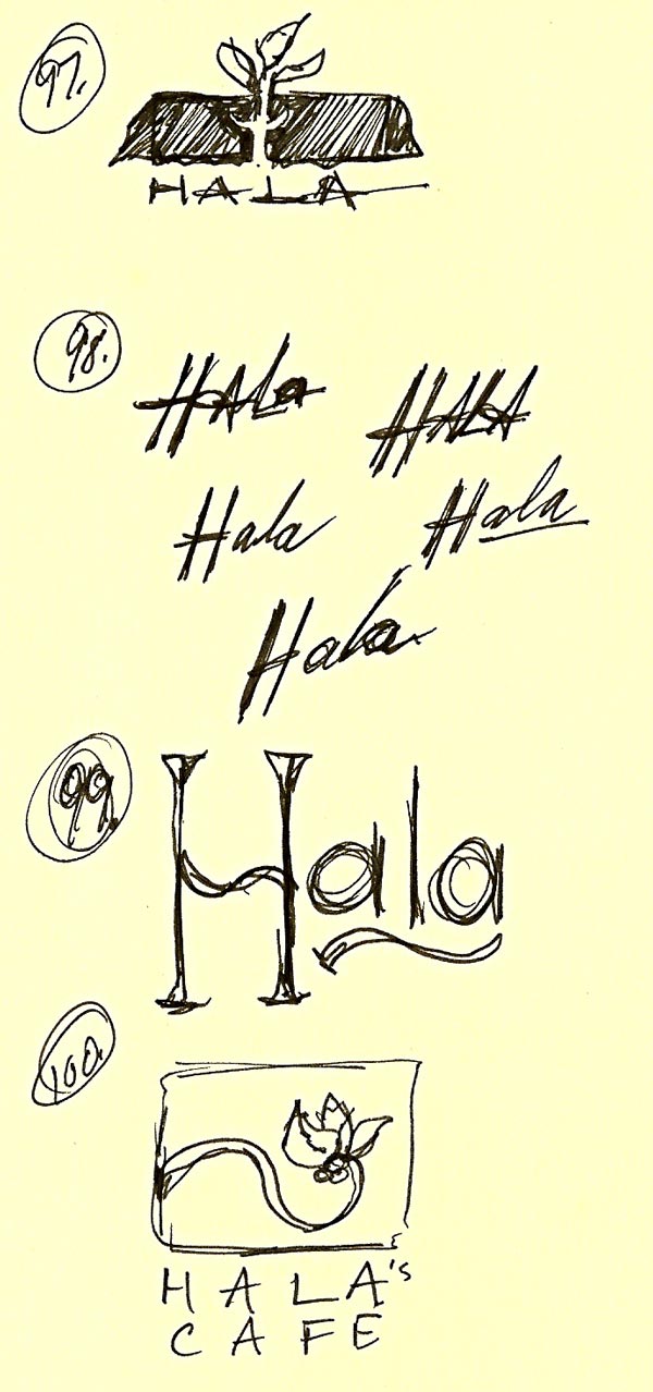
There you have it…100 logo sketches. I welcome you to leave me your thoughts if you wish to share them. I will begin refining my ideas soon and appreciate all the insight you all may have.


by Amanda Kern
6 comments